It's worse than white text on black for me. My eyes are fighting to resolve which is supposed to be background and what's the letters. It's like the green in the 'O' is trying to jump out of the screen at me.
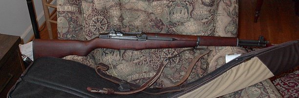
To be confident and competent enough with a rifle to be able to hit anything I can see in a Jovian Thunderbolt kind of way.
To be able to defend myself with a handgun.
To perhaps harvest some tasty venison with either a rifle or a shotgun, any skin or antler is just a nice bonus, here.
And, if necessary: To Defend the Ramparts of Democracy from a Level 4 Zombie Outbreak or against the Jacobin, Rampaging, Godless, Red-Commie Hordes (or their modern equivalent.)
"You never select a shotgun as your primary anti-zombie firearm. It's great for onesy twosey, but zombies travel in hordes. The reload time is onerous, and the ammo, while effective, is heavy and bulky and short ranged."
Big Mistake for Her
If Ginsberg had let Scalia put the words "strict scrutiny" in Heller and Hillary said "Gun control is just not going to be a priority for my administration," Hillary would have been elected President.
People I Hit F5 on all day, hoping for more content...
Crime Stats
-
Via John H: Background here:
https://pjmedia.com/matt-margolis/2026/05/22/the-left-tried-to-destroy-kash-patel-crime-data-just-vindicated-him-n4953137
I’ve...
Silencer Saturday #433: Scout Rifle Silencers
-
Good afternoon, everyone, and welcome back to TFB’s Silencer Saturday,
brought to you by Yankee Hill Machine, manufacturers of the new Victra
20-gauge shot...
SIG Manurhin 543 Semiauto: I Really Like This Rifle
-
SIG introduced the 540 series of rifles in 1973, which included the
full-length 540 in 5.56mm, the 541 in a number of experimental calibers for
the Swiss m...
Radney Foster - Angel Flight (Radio Tower Remix)
-
This weekend is Memorial Day, the traditional BBQ kickoff to summer. But
on these shores, it's the day to remember the fallen from past - and
current - ...
Tulsi Gabbard Out...
-
Tulsi Gabbard is out, and what are the odds that her old job will
become one more hat for Marco Rubio to wear?
I don't agree with Mr. Rubio's pos...
Trumpy DoJ Fuckery Continues
-
A federal judge on Friday dismissed a human smuggling case against Kilmar
Abrego Garcia, finding that the Justice Department’s pursuit of criminal
charge...
Weekend Knowledge Dump- May 22, 2026
-
Knowledge to make your life better. If you have some free time, check out
some of these links this weekend. Upcoming PMO Study and Shooting
Standards Co...
Defense of a Third Party – Double Trouble
-
“What’s the difference between truth and fiction? Fiction has to make
sense.” Variously attributed to Mark Twain, Tom Clancy, and other notable
authors of ...
The New Resistance to the 2A
-
You can see the resistance is shaping up around “sensitive places” doctrine
and “good moral character.” I remember seeing a comment from Prof. Adam
Winkler...
Light blogging
-
Minor medical condition taken care of. Nothing to worry about. But requires
a lot of couch time. Back later. Kamagra Ohne Rezept Kaufen
Eighteen Years Ago Today...
-
Eighteen years ago today, my son was born. TheBoy entered the collective
conscious, bringing "father" to the list of names I proudly wear. He's off
to the ...
We the people of the United States, in order to form a more perfect union, establish justice, insure domestic tranquility, provide for the common defense, promote the general welfare, and secure the blessings of liberty to ourselves and our posterity, do ordain and establish this Constitution for the United States of America.


1 comment:
It's worse than white text on black for me. My eyes are fighting to resolve which is supposed to be background and what's the letters. It's like the green in the 'O' is trying to jump out of the screen at me.
Post a Comment